| |
Statistics
What is a popular sport in your community? Which is the best team? How do you know for sure? One way is to keep detailed records of
each team’s performance. These records are called statistics. How might you use computers to organize and keep track of this type of
statistical information?
 |
Plan It |
| |
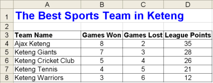
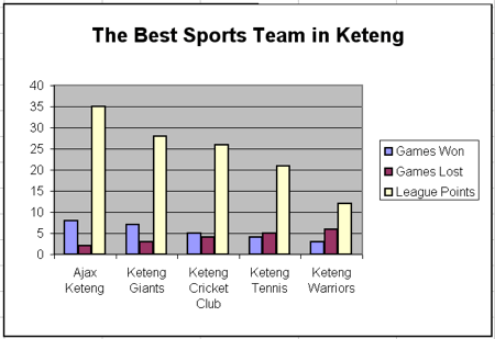
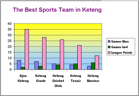
Create a spreadsheet of statistics about your favourite sports teams. Look at the following examples:

Think about the following questions, and discuss your ideas with your
partner. You might want to write your ideas on a sheet of paper.
- Which sport do you and your partner like best and know the most about? What are the names of five teams that play that sport?
- How can people tell which teams are the best? Do people look at which teams have won the most games? Do people keep track of how many points a team scores during each game?
- If you do not know enough about the teams you want to include in your spreadsheet, where could you find the information you need?
Remember to use the rubric as a guide as you plan, do, review, and share.
For help on how to do certain skills, look at the following groups in the Help Guide:
- Spreadsheets Group 2: Selecting Cells, Rows, and Columns
- Spreadsheets Group 4: Adding and Working with Information
- Spreadsheets Group 5: Changing the Look of Information and Worksheets
- Spreadsheets Group 6: Organizing Information
- Spreadsheets Group 8: Making Charts
|
| |
|
 |
Do It |
| |
- Start the spreadsheet software, and open a new, blank spreadsheet.
- In cell A1, type a title for your worksheet. You should mention the name of your chosen sport in the title.
- In cell A3, type “Team Name”. Then in the cells below, type the names of the five teams you will be keeping statistics on.
- In cell B3, type “Games Won”. In cell C3, type “Games Lost”. In cell D3, type “Points scored”. If you would like to include any other types of information about the teams, type the column labels in empty cells in row 3.
- Enter the real or imaginary statistical information in the correct cells. As needed, change the width of the columns.
- Sort the rows so the teams are listed in an order that makes sense. For example, you might want to list the teams in alphabetical order or in
numeric order according to how many games they have won.
- Change the look and alignment of the information as needed, and add borders and colours to the spreadsheet cells.
- Create a column chart that compares the five teams. Give your chart a title, and save it as a new sheet.
- Save your work as directed.
|
| |
|
 |
Review It |
| |
Look over your statistics spreadsheet. Make sure it has the following
elements:
- Worksheet with five team names, and information for each about the number of games won, the number of games lost, and the number of points scored for each team
- Important information, such as the title and column labels, formatted to stand out and cells formatted with borders and shading
- Information sorted in a way that makes sense
- Column chart that compares the statistics of the five teams
If any elements are missing, add them now. If you want, make other changes, as well. Remember to save your work when you are finished.
|
| |
|
 |
Share It |
| |
Be prepared to discuss your answers to the following questions:
- Based on the completed worksheet and chart, which team is the best? How can you tell?
- What did you do to help make important information stand out? What did you do to make the information about the teams easy to read?
- Why did you decide to sort your information the way you did?
- For what other subjects could you gather and organize statistical information? How might the spreadsheets be similar to or different from the one you created for this activity?
|
|


