| |
Pictograph
Ms. Singh needs to organize the healthcare survey information that
you helped her gather in the Survey Form activity and find an easy
way to show the results. How might you be able to help her? One way is to put the information into a spreadsheet and then make a special type of chart made out of pictures, called a pictograph. How might the information be organized in a spreadsheet? What might a chart of that information show?
 |
Plan It |
| |
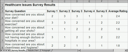
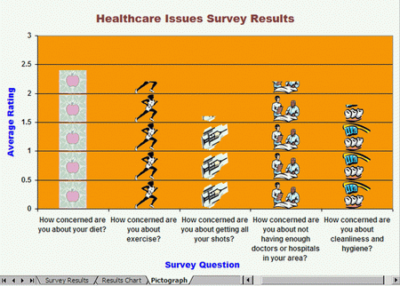
Create a worksheet and a chart that shows which healthcare issue is the biggest concern to a group of people, such as your classmates. Look at the following example:
Think about the following questions, and discuss your ideas with your
partner. You might want to look at the completed survey forms that are saved on your computer as you write your ideas on a sheet of paper.
- How might you organize the survey questions and answers into a spreadsheet?
- How could you use spreadsheets to figure out which issue is the biggest concern?
Remember to use the rubric as a guide as you plan, do, review, and share.
For help on how to do certain skills, look at the following groups in the Help Guide:
- Spreadsheet Group 3: Using Worksheets
- Spreadsheet Group 4: Adding and Working with Information
- Spreadsheet Group 5: Changing the Look of Information and Worksheets
- Spreadsheet Group 7: Doing Math
- Spreadsheet Group 8: Making Charts
|
| |
|
 |
Do It |
| |
- Start the spreadsheets software, and open a new, blank spreadsheet. If one of the completed survey forms is not open already, open one now. (NOTE: You might want to make each window smaller and move them around so you can see as much of both documents as possible.)
- In cell A1, type a title for your new worksheet. Change the look of the title.
- In cell A3, type "Survey Question" as that column's label. Then in the cells below, type the survey questions found on the completed survey form. Make sure you put each question in its own cell.
- To make the cells with the questions big enough to fit all of the words, change the text wrapping in each cell, and make column A wider.
- In cells B3 through F3, type "Survey 1", "Survey 2", "Survey 3", "Survey 4", "Survey 5", and "Survey 6" as those columns' labels.
- In the column B cells below the Survey 1 label, type the number rating answers for each question on the completed survey form. Close the survey form when you are done.
- One at a time, open each completed survey form you have saved on your computer. Then in the cells below each column label, type the number rating answers from that survey form. Be certain to close each document before you open the next, but when you are done typing the answers from the fifth form, leave that form open.
- In cell G3, type "Average". Then in cell G4, insert an Average function. (NOTE: Make sure that all the rating numbers from that row are included in the formula.) Then, fill the Average function into the cells below so there is an average rating for each survey question.
- Change the look of your column labels in row 3 so they stand out. You can also change the look of the information in the rows below the labels so it all looks the same.
- Select the column A cells with the survey questions. Then, hold down the Control key and select the column G cells with the calculated averages.
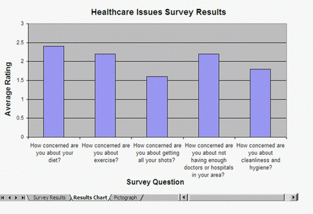
- Make a column chart with the series or data series in columns. Use the title on your worksheet as the title for your chart. Also, use your column A label (in cell A3) as the x-axis title, and the average column label (in cell G3) as the y-axis title. Save the chart as a new sheet, and delete the legend since it is not needed.
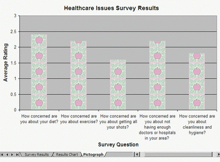
- To create another type of chart with the same information, duplicate or make a copy of the sheet that contains the column chart, and move the copied sheet to the end. (NOTE: If you are using OpenOffice.org Calc*, skip Steps 13 and 14.)
- Make sure one of your completed survey forms is still open. Open the Clip Art Gallery, find a health-related picture that you would like to use in your chart, and copy the picture. (For help, see Graphics Skill 3.15: To copy and save a picture from the Clip Organizer.)
- Launch the graphics paint software, and paste the copied clip art picture into a blank painting. As needed, resize the canvas so it is the same size as your picture. Then, save the new painting in a place where you can easily find the file.
- Go back to the second chart in the spreadsheets software, and turn the chart into a pictograph by formatting the columns with the copied picture. Or if you are using OpenOffice.org Calc, format the columns with the preset bitmaps. (NOTE: If you are using OpenOffice.org Calc, you may not be able to find images that relate to health. Just select the image you like best.) (For help, see Spreadsheet Skill 8.10: To make a pictograph.)
- Rename all of your worksheet and chart tabs, and delete any unused worksheets.
- Put all of the tabs in order so the worksheet is first, the column chart is second, and the pictograph is third.
- Save your work as directed.
|
| |
|
 |
Review It |
| |
Look over your spreadsheet. Make sure it has the following elements:
- Worksheet with the completed survey information entered and averages calculated
- Column chart and a pictograph that show the survey results
- Worksheet tabs that have been renamed and put in the correct order
If any elements are missing, add them now. If you want, make other changes, as well. Remember to save your work when you are finished.
|
| |
|
 |
Share It |
| |
Be prepared to discuss your answers to the following questions:
- What information does your pictograph show? Do the results surprise you? Why or why not?
- How is using a pictograph better than making a regular chart?
- What other types of information might you show in a pictograph?
- What other health information might you like to know about your community?
|
|
