Module 11
Applying Spreadsheets
Module 11
Pictograph
For some classroom content, charts are used to explain numeric data
in a way that can be easily understood. One type of chart, called a
pictograph, uses pictures to make information even clearer than regular charts. What classroom content might you use a pictograph to teach your learners? What numeric data might the pictograph show?
![]() Plan It
Plan It
Create a worksheet, a column chart, and a pictograph that can be used to teach a specific topic. Look at the following examples:

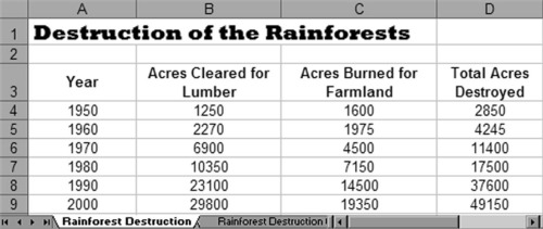
Pictograph Worksheet Example

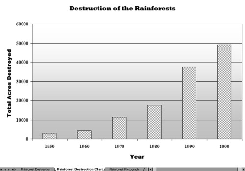
Column Chart Example

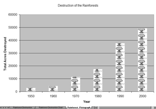
Pictograph Example
Think about the following questions, and if working with a partner, discuss your ideas. Writing your ideas on a sheet of paper and drawing a table that shows how you might put the information in order might be helpful.
To create a pictograph, pick a topic that compares quantities or values in the form of a column or bar chart. You may not achieve the desired result if you create a line chart that shows changes over time or a pie chart that shows the relationship of parts to a whole.
- What classroom content do you use charts to teach? For what specific topic might you create a pictograph?
- What numeric data do you want the pictograph to show? How might you organize the information into a worksheet that can be used to create the pictograph? What row and column labels might you use? What formulas might you need to include to calculate the information in your columns or rows?
- What pictures might you use in the pictograph to help make the
information clear to learners?
For help on how to do certain tasks, look at the following groups in the
Help Guide:
- Spreadsheet Group 3: Using Worksheets
- Spreadsheet Group 4: Adding and Working with Information
- Spreadsheet Group 5: Changing the Look of Information and Worksheets
- Spreadsheet Group 7: Doing Maths
- Spreadsheet Group 8: Making Charts
![]() Do It
Do It
- Start the spreadsheet software, and open a new, blank worksheet.
- In cell A1, type a title for your new worksheet. Change the look of the title.
- In cell A3, type a label for the first column of information that you want to include in your worksheet. Type the other column labels in the cells to the right.
- If desired, change the text wrapping in each cell. You might also want to make the columns wider.
- In the cells below the column heading in cell A3, type the row headings.
- If desired, change the text wrapping in each cell. You might also want to make the columns wider.
- Type the rest of the information you need to complete your worksheet. You might want to include row labels in column A in addition to the
numeric information.
- Format the numbers in your worksheet as needed. For example, you might want them to be displayed as currency, decimals, or percentages. (For help, refer to Spreadsheet Skill 4.9: To show numbers as decimals, currency, and percentages.)
- Perform any required calculations. For example, you may want to insert
a Sum or Average function. Or, you might want to write your own
formulas to subtract, multiply, or divide numbers. (For help, refer to Spreadsheet Group 7: Doing Math.) Fill the function or formula into
adjacent cells as needed. - Select the information that you need to create your chart. If you need to select information that is not in neighboring rows (such as the column
labels and the calculation results), select one group of cells, hold down the Control key, and then select the next group of cells. - Make a column chart with the series in columns. Use the title on your worksheet as the title for your chart. You might also want to type labels for the X axis and Y axis. Save the chart as a new sheet. Delete the
legend if you feel it is not needed. (For help, refer to Spreadsheet Skill 8.1: To make a column or bar chart that compares values or amounts.)
Challenge: Change the look of the chart’s background area and the bars by picking different colors or adding a fill effect. You can also change the look of the main chart title and the two axis titles. (See the Column Chart Challenge Example at the end of this section.)
- Duplicate, or make a copy of, the sheet with the column chart. Move the copied chart to the end.
- Open the Clip Art Gallery, find a picture that you would like to use in
your chart, and copy the picture. For best results, use a simple picture. (Note: If you are using OpenOffice.org Calc*, skip Steps 13 and 14.)
(For help, see Graphics Skill 3.15: To copy and save a picture from the
Clip Art Gallery/Clip Organizer.)
- Start the graphics program, and paste the copied clip art picture into a blank canvas. As needed, resize the canvas so it is the same size as your picture. (For help, see Graphics Skill 2.12: To change the size of a painting canvas.) Then, save the new picture in a place where you can easily find the file.
- Go back to the second chart in the spreadsheet program, and turn the chart into a pictograph by formatting the columns with the copied
picture. If you are using OpenOffice.org Calc, format the columns with
the preset bitmaps. (For help, refer to Spreadsheet Skill 8.10: To make a pictograph.)
Challenge: Repeat Steps 13 through 15 to use a different picture for each of the columns in the chart. (Note: If you are using OpenOffice.org Calc, use a different preset bitmap in the chart.) (See the Pictograph Challenge Example at the end of this section.)
- Rename all of your worksheet and chart tabs, and delete any unused worksheets.
- Put all of the tabs in order so the worksheet is first, the column chart is second, and the pictograph is third.
- Save your work as directed.

Column Chart Challenge Example

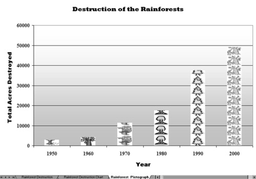
Pictograph Challenge Example
![]() Review It
Review It
Look over your spreadsheet. Make sure it has the following elements:
- A worksheet with numeric information about your chosen subject and any required calculations
- A column chart and a pictograph that show the information
- Worksheet tabs that have been renamed and put in the proper order
If any elements are missing, add them to the spreadsheet now. You should also make other desired changes. Remember to save your work when you are finished.
![]() Share It
Share It
Be prepared to discuss your answers to the following questions during
sharing time:
- What information does your pictograph show? In what ways does a
pictograph make it easier to understand the information than a regular chart? - What was the hardest task in completing your pictograph? How did you manage to complete the task?
- What other types of information might you show in a pictograph?
