|
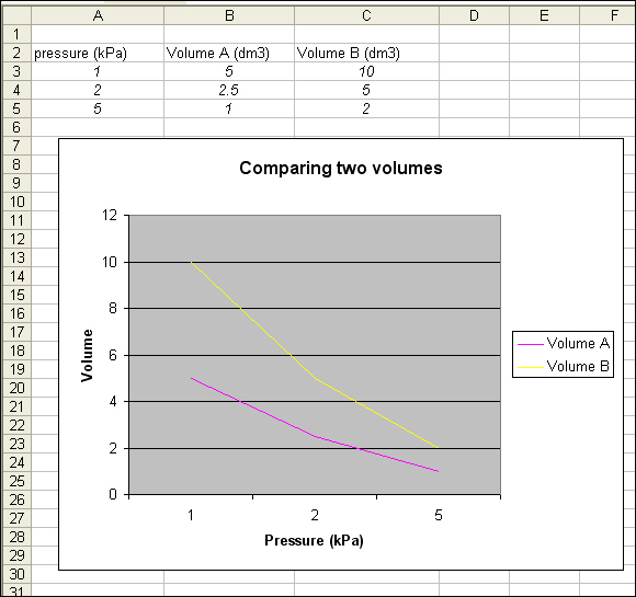
This example will plot a line graph of the relationship between pressure and two different volumes. You can apply the same procedure to any line graph of your choice.
1. Enter data into an excel spreadsheet.
NB: decimals must be written with points (.), NOT commas (,).
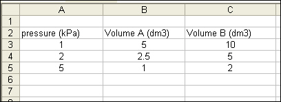
2. Select the data.

3. Click on the Chart Wizard icon. 
4. Select Line.
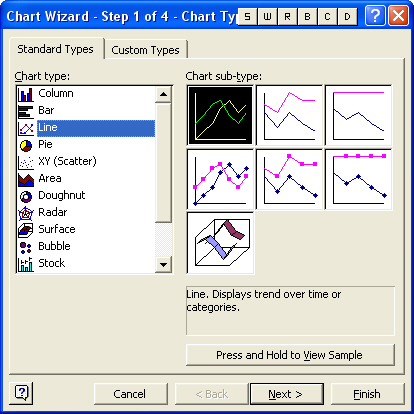
5. Select the desired Chart sub-type.
Note: You can view a sample of your chart by pressing the mouse button on the Press and Hold to View Sample button.
6. Click on Next and then click on the Series tab.
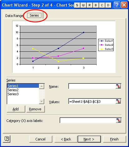
To ensure that you have the correct data selected and labeled for each series follow this routine (from steps 7-11) for each series:
7. Click on Series1 in the Series window
8. Click in the name bar and type the name of the series ("Pressure" in this case).
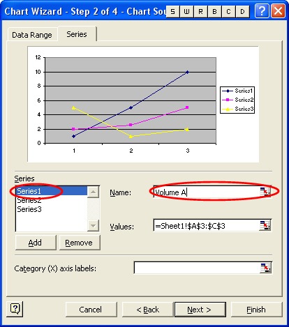
9. Click on the cell selector icon to the right of the Values bar.
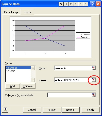
10. Select the values that you want to plot in this series (note that cells B3- B5 have been selected).

11. Press the Enter key on the keyboard to select it.
12. Once the series have been named and selected, click on OK.
----
13. Select the data field for the X-axis labels. In this case the pressure data is being used as the basis for comparison, so the fields A3-A5 were selected.
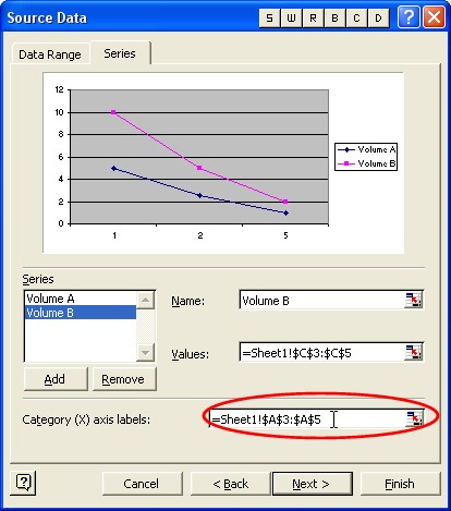
14. Enter the chart title and labels for the x and y axes.
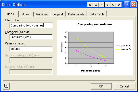
15. Click on Finish.
|